User experience is attention to detail
As developers we are constantly throwing together forms so user’s can enter data. It’s a fairly common task but because of this frequency we can forget to ask ourselves why when it comes to the decisions we have to make. Something as simple as which fields are mandatory can impact the user experience in a negative way if the different options are not considered.
Take Chrome’s add bookmark form for example.
When you click the star in the address bar to bring up the dialog you are presented a form with two inputs: name and folder.
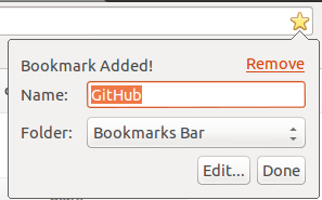
All too often a developer would decide that both inputs should be mandatory. Usually this would be fine since “Name” is probably mandatory 90% of the time.
Blindly making something mandatory can have negative effects on the user experience. If this field was mandatory it would limit the real estate space on the Chrome bookmark bar - thus limiting it’s usefulness.
Since Google is great at building awesome user first interfaces (UFIs?) they took the time to make the decision that name can be optional. As a result you can have icons without names on your bookmark bar. Since most websites have favicons we can get more bookmarks on our toolbar than we could of with names beside the icons:

Since most users are familiar with app icons (via smartphones or whatever) our bookmark bar now looks like an app bar. Which is both intuitive and easy on the eyes.
So remember this rule:
If you are forcing a user to take an action you should first ask yourself why and consider what impact this will have on the overall user experience.